Case study
The Inccubator
Role
UX Designer, Research Lead
Type
Client project, Group of four
When
October 2020
Timeline
3-week sprint
Methods
the mission
A UX consultation and redesign for a multicultural social media website in Beta
Overview
My team of four met with our client, the creator of the Inccubator*, to bring UX expertise to the site while still in Beta.
What our team found was a social media platform whose mission and vision were admirable but whose execution needed focus. In the end, we delivered an in-depth research package as well as a high-fidelity prototype that focused heavily on the website's information architecture.
*Yes, this is the correct spelling.

THE INCCUBATOR
Introducting The Inccubator
The Inccubator is a multicultural social media platform where digital magazine publishing meets social networking.
It provides content through an array of digital magazines, or content channels, that represent cultures and communities that are often underserved. While articles in the digital magazine are written by the Inccubator’s team of writers, users can also find blogs, videos, and other content created by other users and social media influencers.
Access to the Inccubator is free, but users can pay a monthly subscription to read unlimited articles. Content creators and influencers find a source of income when followers commit to giving monthly contributions.
The Inccubator contains features found on Facebook, LinkedIn, and YouTube, among others, but it is unique in that it offers all of these features in one place.

Select images to enlarge.

The Inccubator in Action

#1 Before entering the Inccubator, a new user must register. This includes choosing a content channel, which will become the home page. A dropdown menu provides a brief description for users learning about content channels for the first time.

#2 After registration or login, the user lands on the home page of the content channel they chose. Currently, there are 10 content channels in total.

#3 A dropdown menu allows the user to navigate between content channels. The content on each home page changes, but the newsfeed stays the same.

#4 The user can add photos, videos, blogs, and more to their profile. The current profile requires significant scrolling to view all information.
RESEARCH
Competitive Analysis
Facebook is Inccubator’s biggest competition in terms of the number of features offered to users. Youtube offers the fewest features, but perfect execution of those features has made it the second most visited site in the world.

User Research
Because the Inccubator is still in development, we could not interview current users. Instead, we interviewed two sources of potential users to get their insights.
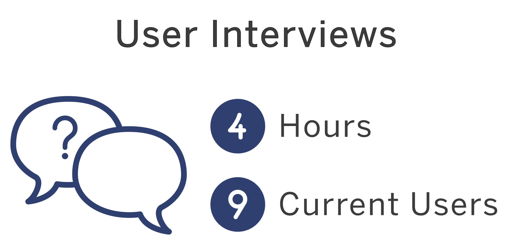
Beta Users
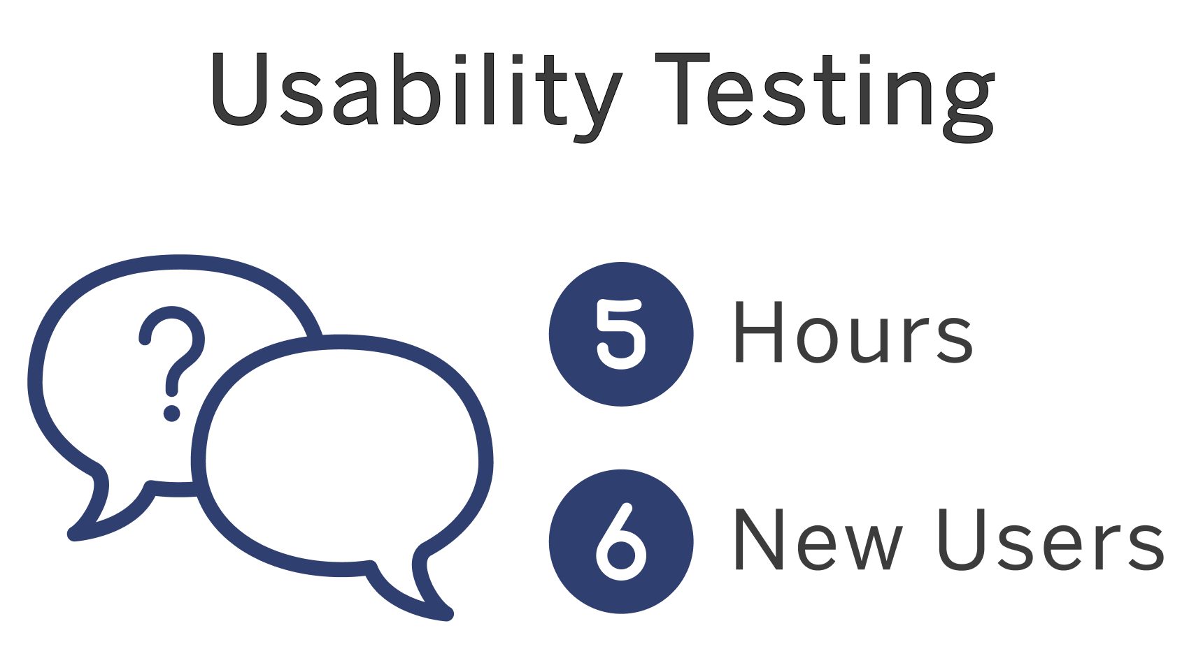
Target Users
Because the clients' contacts had prior exposure to the site, we wanted to interview potential new users that fell within the target market.
Users shared their impressions of the site while completing the following tasks:
1. Register for site
2. Log in
3. Write a blog post
4. Post a video
SYNTHESIS
Affinity Mapping
Select images to enlarge.
What am I intended to do on the site?
• "At first I thought it was a news site."
• "Feels like Facebook and LinkedIn."
• "Inccubator sounds tech-y."
It is not surprising that users had questions related to the tone of the site. The client said that the Inccubator initially closely reflected the networking site, LinkedIn, but over time, it has come to resemble Facebook. This left one user asking, "Is it appropriate to post a meme of Kermit the Frog?"
How do I navigate the site?
• "There should be some type of home page."
• "Navigation is not social."
• The site needs "more consistent hierarchy."
Users said that many pages looked the same, which made navigation confusing, and the lack of homepage made them feel disoriented. They also said that the content channel pages felt very segmented, which did not seem consistent with a site promoting community.
How do I use the site?
• "I'm not quite sure what I'm supposed to be doing."
• "Some of the wording is confusing…"
• "Needs simple video content or tutorial."
The Inccubator offers many unique features, but our research found that users did not know what many of them were or how to use them. Without some form of user onboarding or tutorial, users may become frustrated and leave the site.
User Personas
From insights gained from interviews and affinity mapping, we were able to identify three key users of the Inccubator. We kept these users’ needs in mind as we determined the problem and began to ideate a solution.
Cultural Explorer
The cultural explorer wants to read and learn about other cultures, but will likely not contribute her own content or become a paid subscriber. She will use the site to:
Learn about different cultures she interacts with everyday
Gain different perspectives in society, lifestyle and culture
Connect with people with similar interests and content
Social Media Influencer
The social media influencer’s primary focus is to gain empowerers and promote her brand. She will use the site to:
Monetize her brand to become her main source of income
Be a role model in her under-represented community
Easily upload and share content
Business Entrepreneur
The business entrepreneur is primarily interested in networking and expanding his community. He will use the site to:
Inspire people with his background and story
Motivate future business owners
Network for opportunities of investment and connection

The Problem
Users need a more intuitive way to explore and engage with content on the Inccubator so that they can connect with other users and learn about different cultures.

The Solution
By restructuring the information architecture of the Inccubator, we will provide users with more intuitive navigation and consistent content structure.
Addressing navigation, tone, and user onboarding was out of scope for a three-week sprint. Believing that user onboarding and tone would continue to be issues for a site that was not navigable, we focused our efforts on site navigation. We planned, however, to include recommendations for clarifying the tone and educating new users in our final research deliverable.
DESIGN
Information Architecture
The Inccubator has a large amount and wide variety of content, so it is crucial that users understand where they are in relation to the rest of the site. Our team studied the current site map to find areas of confusion. The goal here was not to remove features or content but to minimize navigation and make existing features easier for users to find. (Select images to enlarge.)
Design Studio
Our team conducted a design studio where we brainstormed and sketched ideas for the sections of the site we were going to tackle. We concentrated on the user's initial landing page, the profile page and a content channel's landing page to maximize the time we had during this design sprint, as we determined these were three opportunities for improvement with the greatest impact.
Opportunities
#1 - User Landing Page
Challenges
Users were confused about the intent of the page. Without a home page, they felt disoriented. They wondered why the same news feed appeared on ten different content channel pages.
Features of different priority were given equal space and placement on the page. Users were overwhelmed and unsure of what to do first.
Recommendations
Build a central landing page separate from content channels, which can act as a home page.
Simplify the layout of the page to add hierarchy of features and break up the page visually.
#2 - Profile Page
Challenges
When users added content, such as blogs or videos, they did not understand that the content was available to view on their profile.
The user had to scroll a long way to take in all of the information available. If a user does not fill in a category, such as their academic path, the user had to scroll past a blank box.
The original profile design seemed flat and boxy. One user commented that it looked like the back end of a site, not a finished design.
Recommendations
Provide a hub for users to reference their published content.
Utilize tabs to group content and minimize scrolling.
Add more color and visual interest, such as photographs of articles and videos, clusters of content, and CTAs.
#3 - Content Channel Pages
Challenges
Each content channel home also acts as a landing page, effectively creating ten landing pages.
Users had to navigate through the site to find content related to one content channel. For example, to view Latinx videos, they had to leave the Latinx page and navigate to Videos. To read Latinx blogs, they had to navigate to Blogs.
Recommendations
Create a central hub for each content channel, separate from the landing page.
Group all content related to a content channel, such as articles and videos, on its content channel page. If a user is interested in one content channel, he or she will find a wealth of information in one place.
PROTOTYPE
The Prototype
Usability Testing
What started as a low-fidelity grayscale prototype went through two rounds of usability testing before arriving at the current high-fidelity iteration. We were pleased to hear that users found navigation easy. They also responded positively to the new color palette after a few tweaks, such as add more gray tones to the the brighter teals and mauves.
There was, however, room for improvement.
#1 - Landing Page
Users found the new landing page overwhelming. The three equally spaced columns fought for the users’ attention, and information needed to be organized and prioritized.
In the next iteration, we reduced the number of columns from three to two, and made the News Feed column wider. We also moved some features, such as the suggested Incc. Card of the Day, to the News Feed, so that there were fewer components in the remaining column competing for the users’ attention.
#2 - Empowerment Symbol
Users commented that our Empower fist symbol resembled the symbol used by the Black Lives Matter movement. Not wanting to copy someone else’s symbol, we let users decide how to represent Empower.
100% of users tested preferred the first option, an “e” that resembles the Inccubator’s gear logo.
#3 - User Onboarding
User onboarding fell outside of the scope of our three-week sprint, but it is an important future recommendation that we included in our research deliverable.
The Inccubator contains a lot of site-specific features and terminology, which give it a steep learning curve. We provided mockups showing how we imagined a step-by-step tutorial of the Inccubator’s features would look.
TL;DR
TL;DR
By creating a central landing page, reformatting the user profile, and building out individual content channel pages, we were able to simplify the information architecture and make navigation more intuitive. A visual re-design also gave the website a more modern and community-oriented feel. Users responded positively to the new design and were able to complete tasks quickly and explore the Inccubator’s features easily. Next, we recommend that our clients develop user onboarding to help new users understand the tone of the site and the meaning of its terminology,
At a follow-up meeting with our clients, we found out they are working with developers to implement some of our changes and recommendations. We understand that not all of our recommendations will make it into the Inccubator at launch, but we believe that we were successful in creating intuitive navigation and providing valuable insights into the user experience.
We believe in the Inccubator’s mission to provide an online source of content and community for underrepresented groups. This site is needed and long overdue. We are grateful for the opportunity to be a small piece of the Inccubator’s story and eagerly await its launch.